|
About Notes
|
08/15/20 1:31 PM |
|
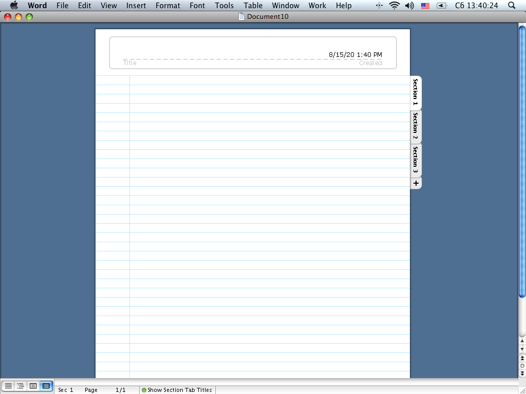
I thought I would include this little about section to explain the aesthetical origins of the design of the Notes pages on my site. I recently (Jul '20) acquired an iBook G4 from [REDACTED] and started using it as my primary web-browsing and word-processing computer. (I normally used to use my 2014 MacBook Pro for everything, but now I usually reserve it for more intensive programs like Ableton Live as well as streaming music from YouTube.) Luckily, Word 2004 came pre-installed on it, and I instantly fell in love with the notebook layout and how it looked on the screen, so I decided to devote a number of hours to replicating it and paying homage as best I could for people who also appreciate the aesthetic. The actual laying-out of the template made with HTML/CSS was relatively straightfoward. The page consists of two div elements, one for the header bit and one for the body, each of which have just the raw screenshot of the respective elements as the background. I did this so I could keep a generic template and just add editable text on it without having to go and screencap everything and just display each Notes page as pictures. The text may not line up perfectly with the lines on all devices, but I think it still looks pretty decent. It's definitely the best work I've done with HTML/CSS thus far. Another thing I just wanted to mention: the font you're looking at right now is entirely custom made. I had no way to really replicate how it looked on the iBook perfectly other than making a custom bitmap font that is a pixel-for-pixel copy. It took several hours but I managed to do it, even with some ßpéçîål çhärãçtèrs for good measure. Pixelated Verdana never looked so good! I truly have dedicated a lot of time to make the pages as close as possible to the original sauce, so I do hope that you enjoy it! |